Measures of community
The MoC project was a project where we took data from the field and applied to real life. Using graphs and spreadsheets we saw our data come to life and noticed some cool patterns. After looking at our graphs we made observations. The fun part was when we made an infographic from the data we collected. An infographic is a combinatiuon of pictures, data, and observations.Joe O’Brien
Math/physics
10/8/13
Moc Conclusion
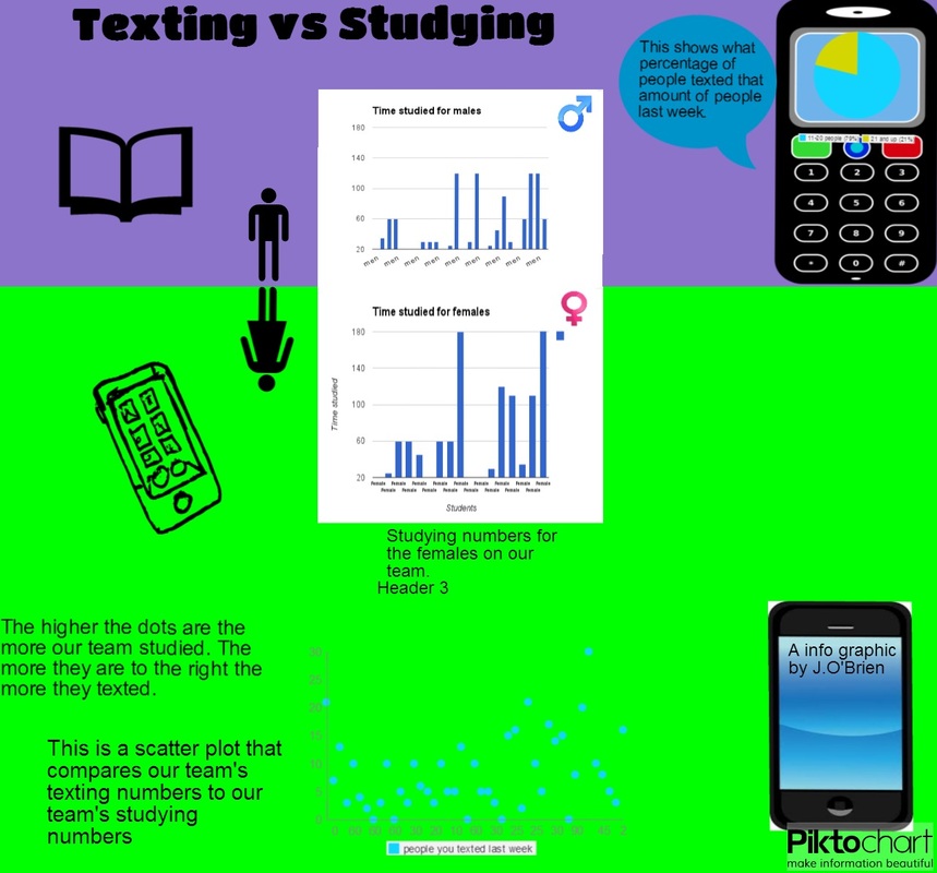
In this project, I noticed that, on our team, females have a higher study time average than the females. The average amount of people texted on our team is around 8 people. A lot of people text a lot and study for a short time, which worries me about our team.
I started off by comparing the data and putting them next to each other I wanted to see if I could notice any patterns before putting them into charts. Only looking at the data I could tell that girls texted way more than guys.
I know that girls tend to text more so I expected there to be high texting numbers. (which there was) As for the guys, their texting numbers were lower and their studying numbers higher. Overall, the results completely matched my expectations, but were only 26 boys and 13 girls who took the survey. So the data was not very accurate.
I plan on showing the graphs to the team and explaining how they need to stop texting as much and spend more time on out of school work. My data shows my previous observation by placing the dots higher instead of to the right side. The higher the dots are the more students texted and the more to the right, the more they studied. The guys have more people that have studied for 60 minutes although they did have more people than the girls. But what my data shows is that more people study for a longer time for the guys. As for the girls when I was looking over the results of the survey, I noticed that girls have had way higher texting numbers. (Keep in mind that this graph does not apply to everyone only the people to took the survey.) I feel like if more people took this survey, I would be able to make conclusions about people in our school. Thank you for reading my conclusion!
Math/physics
10/8/13
Moc Conclusion
In this project, I noticed that, on our team, females have a higher study time average than the females. The average amount of people texted on our team is around 8 people. A lot of people text a lot and study for a short time, which worries me about our team.
I started off by comparing the data and putting them next to each other I wanted to see if I could notice any patterns before putting them into charts. Only looking at the data I could tell that girls texted way more than guys.
I know that girls tend to text more so I expected there to be high texting numbers. (which there was) As for the guys, their texting numbers were lower and their studying numbers higher. Overall, the results completely matched my expectations, but were only 26 boys and 13 girls who took the survey. So the data was not very accurate.
I plan on showing the graphs to the team and explaining how they need to stop texting as much and spend more time on out of school work. My data shows my previous observation by placing the dots higher instead of to the right side. The higher the dots are the more students texted and the more to the right, the more they studied. The guys have more people that have studied for 60 minutes although they did have more people than the girls. But what my data shows is that more people study for a longer time for the guys. As for the girls when I was looking over the results of the survey, I noticed that girls have had way higher texting numbers. (Keep in mind that this graph does not apply to everyone only the people to took the survey.) I feel like if more people took this survey, I would be able to make conclusions about people in our school. Thank you for reading my conclusion!